Mr. Jon approached us with his vision for WayMaker Lean Consulting, seeking a modern visual identity for his new firm. We met to review the details and align on objectives.
The Problem
The challenge was to reflect Mr. Jon’s 20 years of lean manufacturing experience through a modern, professional visual identity. The brand needed to communicate expertise, strategic clarity, and the ability to guide clients through complex business challenges from the ground up.
The Design Approach
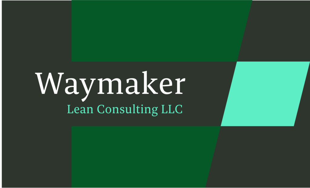
The team organized research, mood boards, and project progress, keeping Mr. Jon engaged throughout. We created buyer personas and mapped target decision-makers to inform strategy. Visual direction was shaped through sketches, analysis of top consulting firm logos, and iterative feedback sessions. Multiple logo concepts were explored and refined collaboratively until final approval.
The Solution
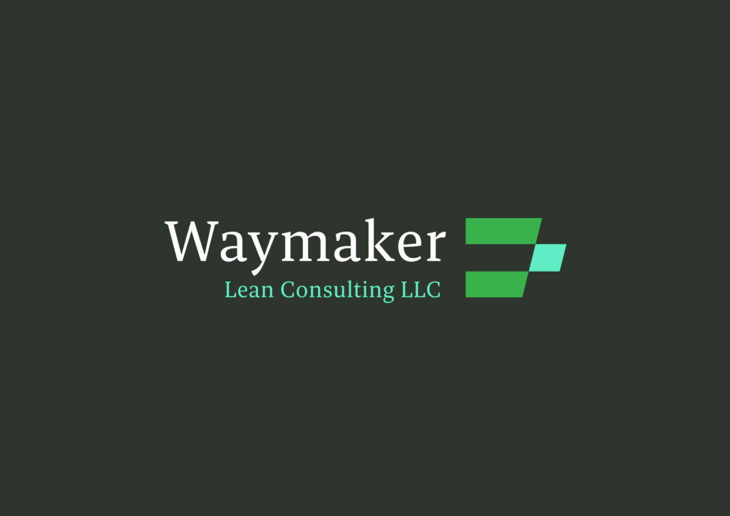
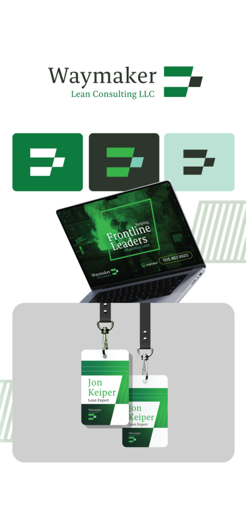
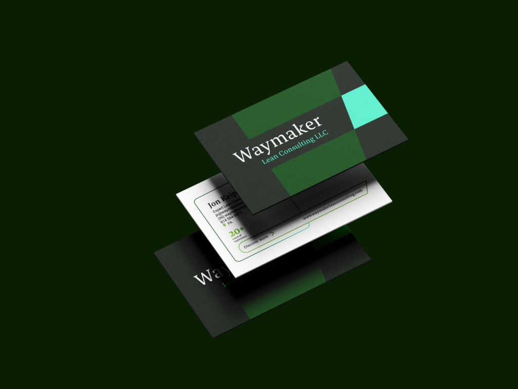
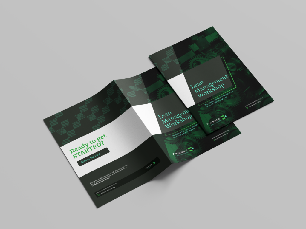
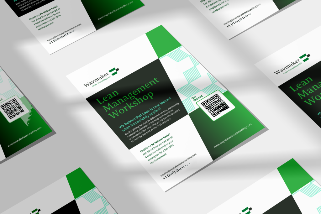
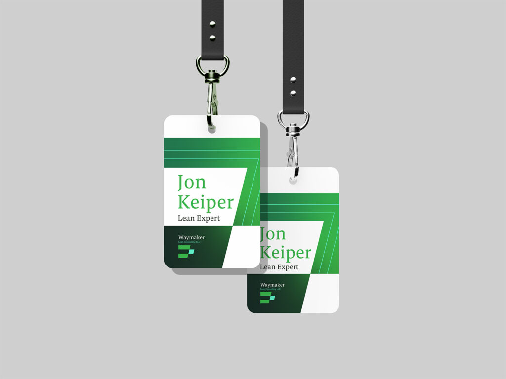
We developed a cohesive brand system that positions WayMaker Lean Consulting as a trusted, results-driven partner. The visual identity conveys professionalism, clarity, and impact, helping the firm establish a strong presence in a competitive consulting landscape.