When a seasoned PR and communications strategist wants to attract Fortune 500-level clients, their website has to do the heavy lifting. It needs to communicate credibility, clarity, and confidence before a single word is read.
That’s exactly the challenge we took on at Elera Design Studio when Farrell Klein, a communications strategist for companies shaping modern retail, reached out for a complete Squarespace website overhaul.
.
Farrell came to us with a clear vision and a direct brief:
“I’d like to streamline my personal consulting website to be only 2 pages, and make it feel more elevated and sophisticated to attract larger size clients that need brand strategy, copy and PR work. I need someone who can take initiative to find any graphics / visuals needed, and/or design them.”
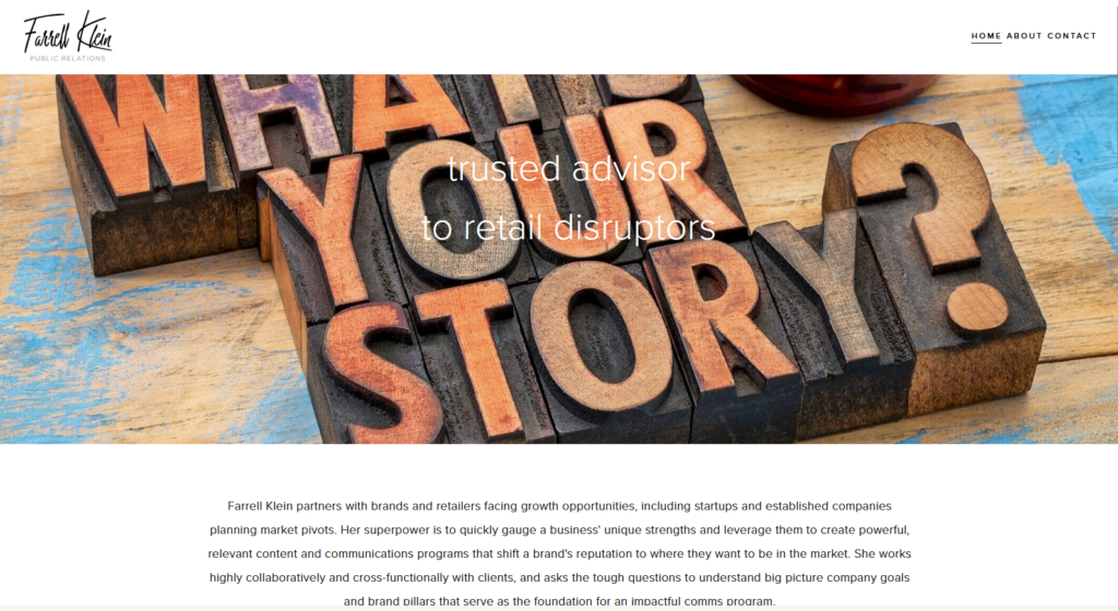
Her existing site at farrellkleinpr.com had good bones, but it wasn’t converting at the level her experience deserved. The layout felt busy, the flow was disjointed, and the overall aesthetic wasn’t aligned with the premium positioning she needed to attract larger, more complex clients.
The core goal: Make the website feel elevated enough to attract larger clients in brand strategy, PR, and communications.
At Elera Design Studio, we don’t open Squarespace before we understand the business. Here’s the process we followed for Farrell’s project:
We started by understanding Farrell’s business goals, target audience, and competitive landscape. Who were her ideal clients? What was the emotional impression she needed to create? What did her competitors’ sites communicate and how could she stand apart?
Before redesigning anything, we analysed her existing site: what was working, what wasn’t, and where the biggest opportunities for improvement lived. Page structure, visual hierarchy, and user flow were all evaluated.
We studied her industry, key competitors, and target audience to inform every design decision, from typography to layout to imagery sourcing.
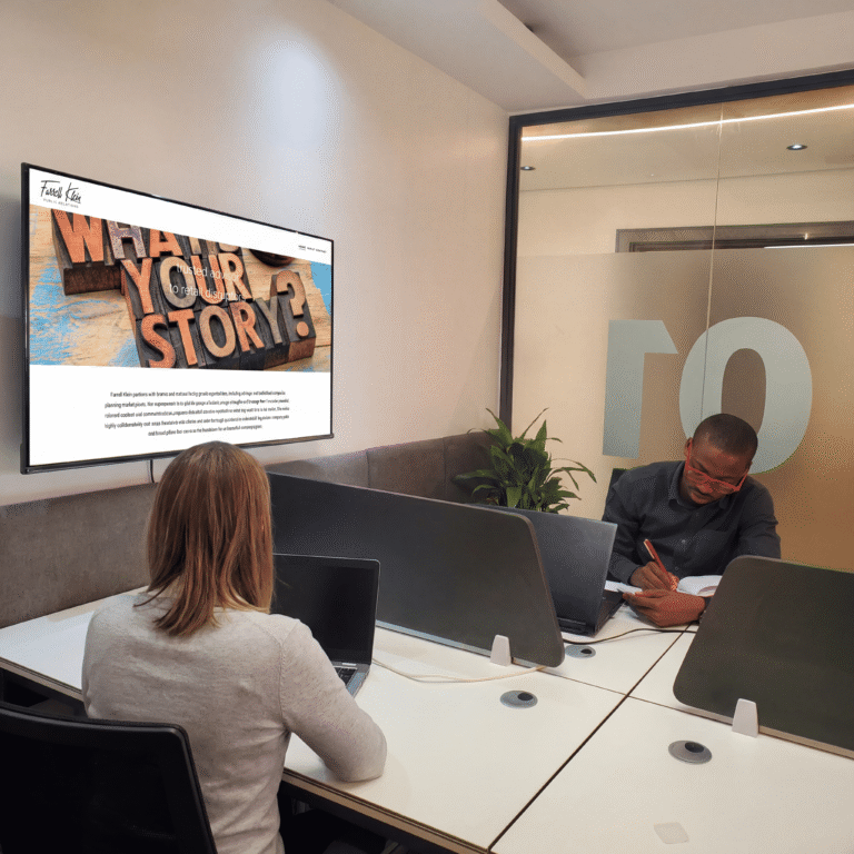
With the strategy in place, we moved into design. This included building the full interface, sourcing editorial imagery that felt premium and on-brand, and creating custom visuals that brought Farrell’s brand story to life.
Great design is collaborative. We refined the site through multiple feedback rounds, making sure every detail met Farrell’s vision and strategic goals.
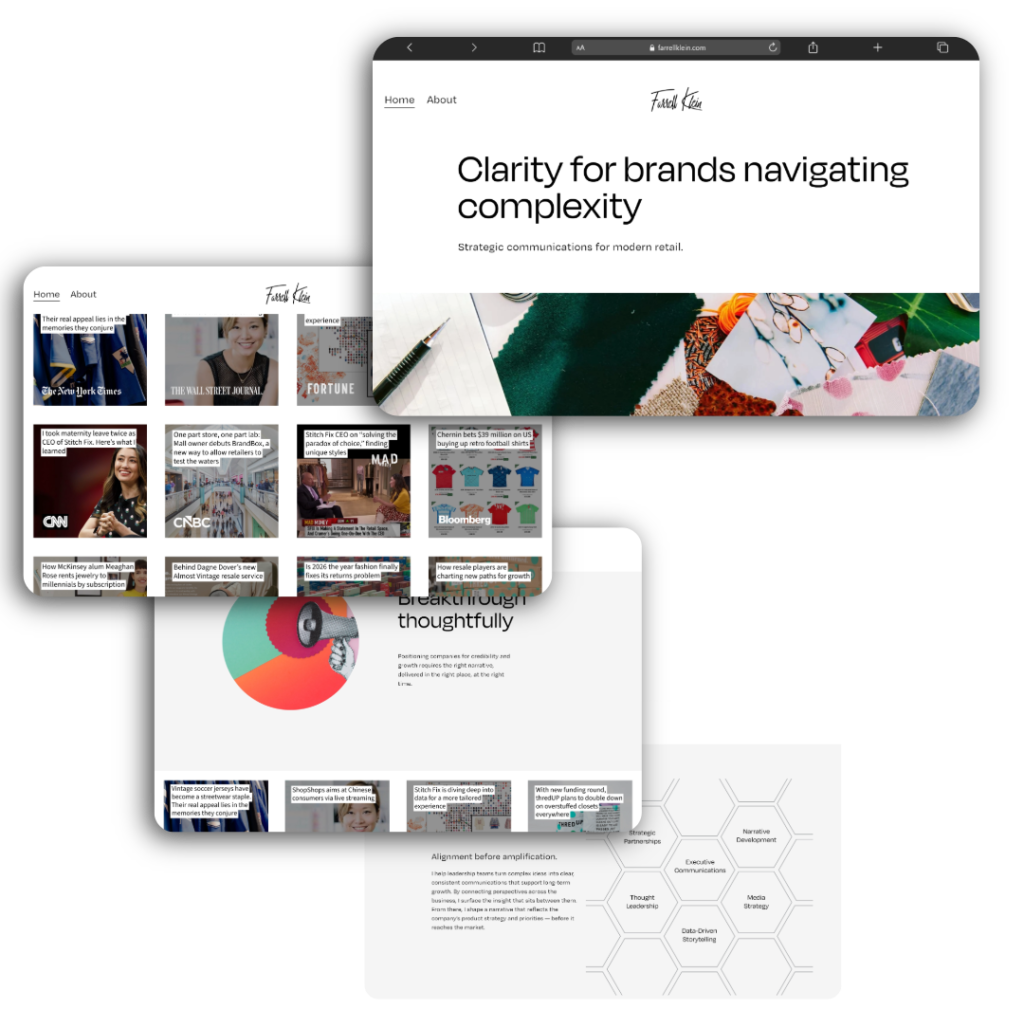
The redesigned site was stripped back to two focused pages intentionally minimal, strategically powerful.
Cleaner layout: Every element has a purpose. No visual clutter.
More white space: Breathing room that signals premium positioning.
Better flow: The user journey moves naturally from curiosity to credibility to contact.
The hero section now leads with a bold, memorable positioning statement:
“Clarity for brands navigating complexity.”
Strategic communications for modern retail.
A curated editorial photo banner immediately establishes the high-end, editorial tone Farrell’s ideal clients expect to see.
The redesign was built responsively across both desktop and mobile. On desktop, the layout uses generous whitespace and a structured content hierarchy to guide enterprise-level visitors through Farrell’s story, expertise, and media presence (including features in The New York Times, The Wall Street Journal, Fortune, CNN, CNBC, and Bloomberg).
On mobile, the same clarity and confidence translates with a clean hamburger nav, the signature Farrell Klein script logo centered at the top, and bold typography that reads effortlessly on any screen size.
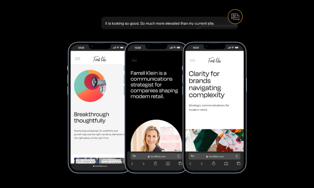
Farrell’s reaction after seeing the redesign said it best:
“It is looking so good. So much more elevated than my current site.”
The new site doesn’t just look better, it works harder. It communicates authority at a glance, speaks directly to the enterprise clients Farrell is targeting, and removes every friction point that was standing between a first visit and a new business conversation.
If your website isn’t reflecting the quality of your work or attracting the calibre of clients you’re ready for, we should talk.
Let’s work together.
