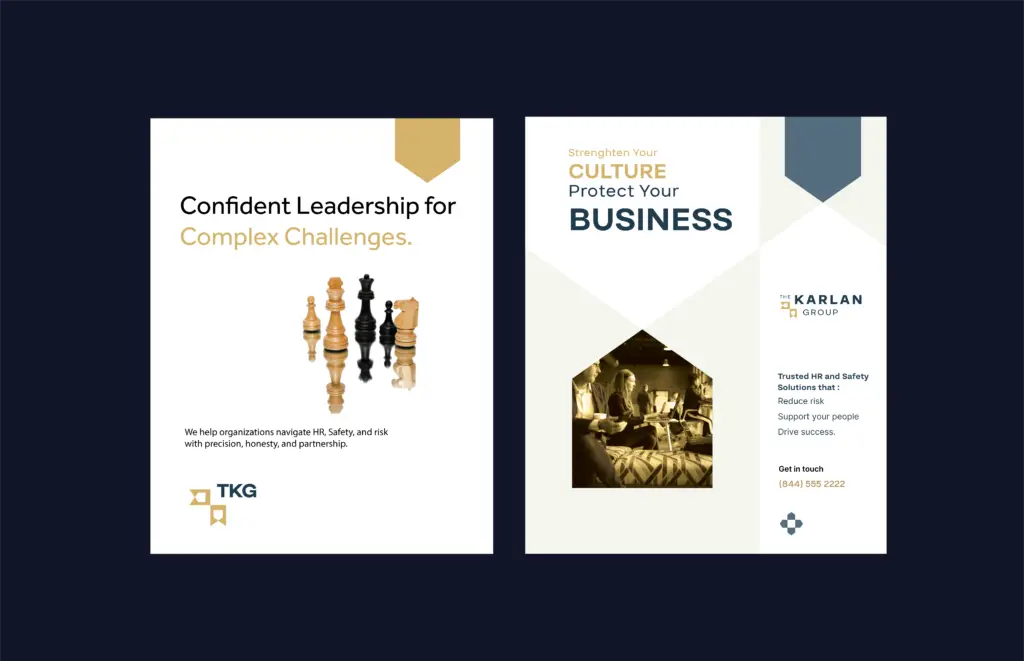
The Karlan Group faced growing brand inconsistency after multiple logo redesigns in a single year. Despite strong leadership and clear expertise in both safety consulting and human resources, the brand lacked a cohesive visual system that could scale with the firm.
The engagement began with the discovery process and strategic review,
The Problem
During discovery, it became evident that the issue was not aesthetic preference, but misalignment. The existing logo failed to reflect the firm’s veteran-led leadership, dual consulting expertise, and people-forward philosophy. Structural issues in geometry and scalability also limited the logo’s ability to function as part of a broader brand system.
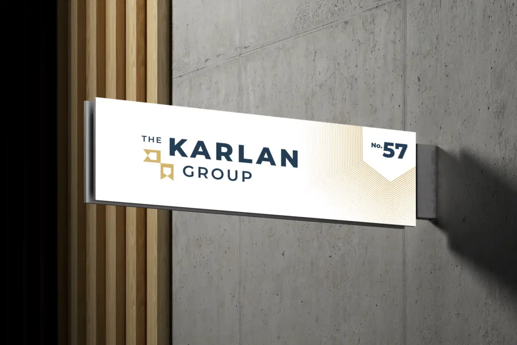
Most critically, there was no clear framework for how the logo could extend across touchpoints creating confusion rather than authority.
The Objective
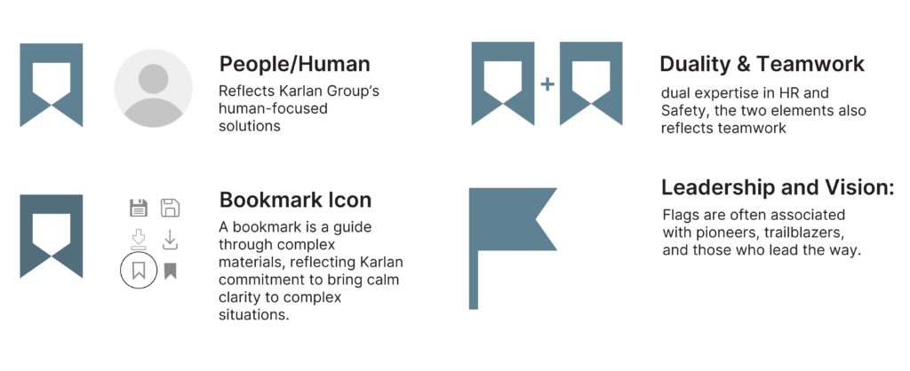
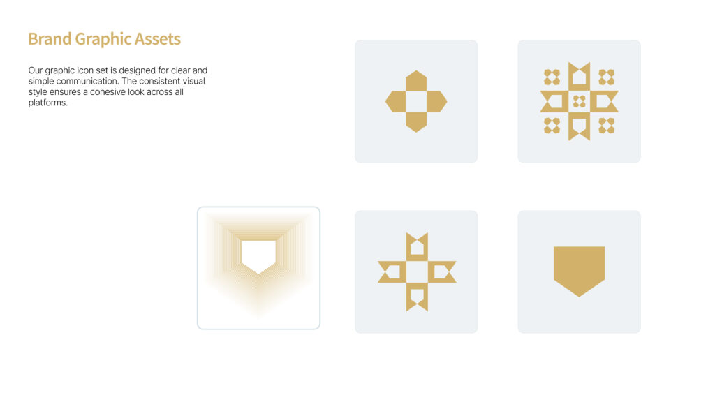
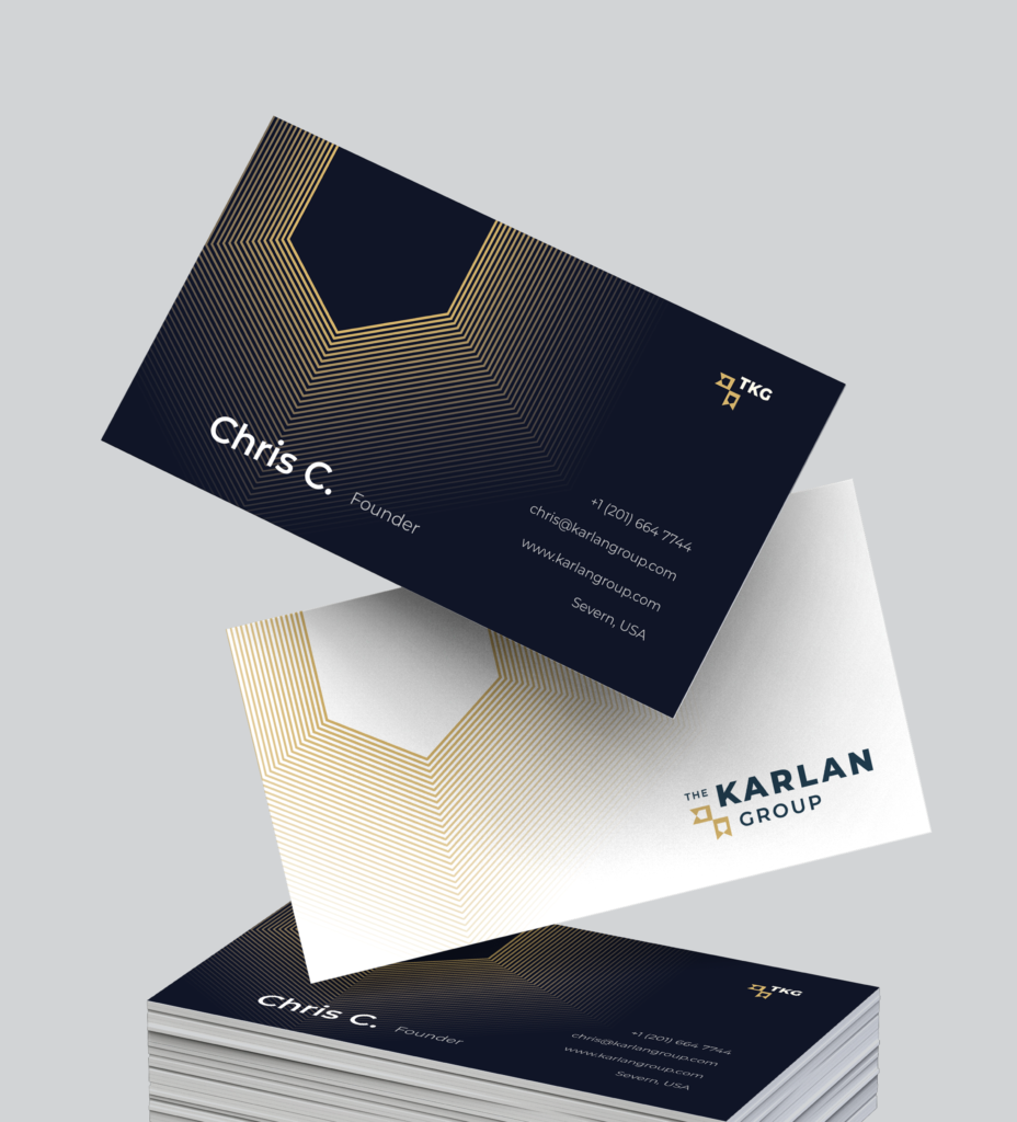
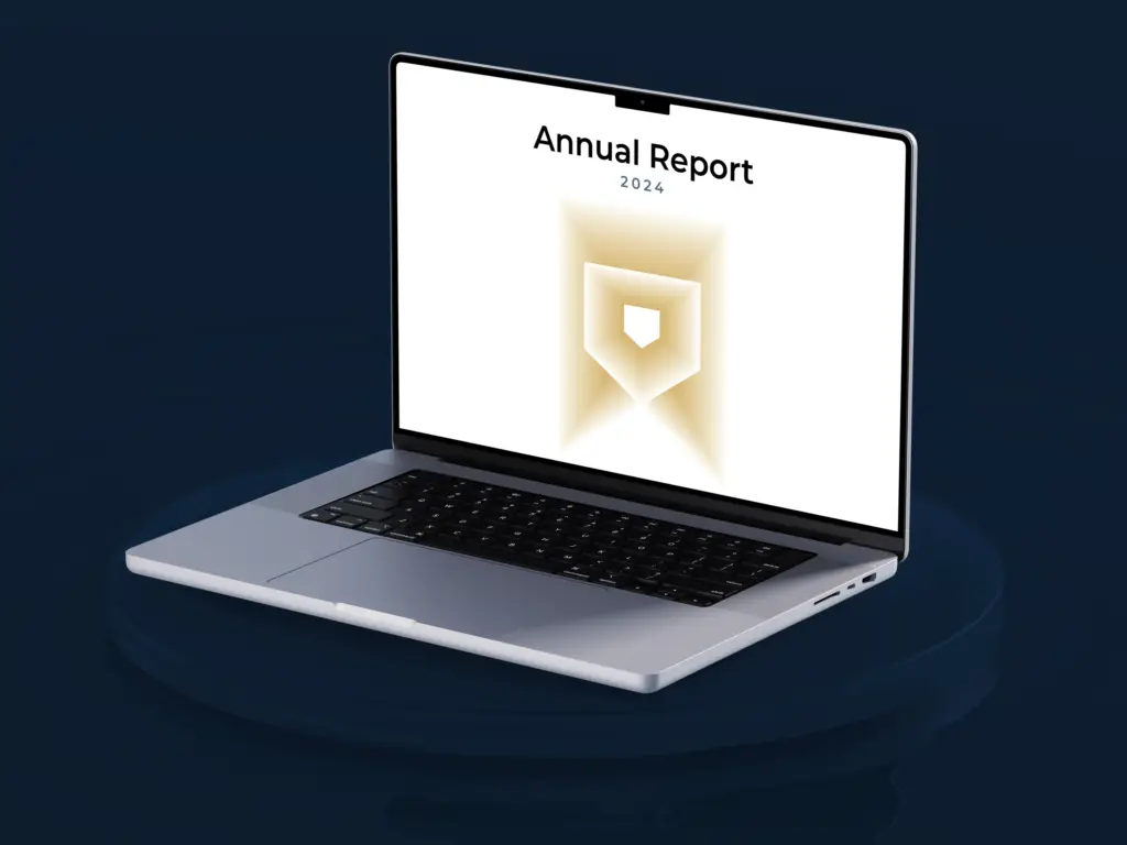
The goal was to create a unified brand identity that communicated credibility, leadership, and clarity. The new system needed to subtly reference the firm’s veteran foundation without relying on literal symbolism, while clearly representing its dual areas of expertise. Existing brand colors were retained, as they already aligned with the firm’s positioning.
The Design Approach
Given the disconnect between the existing logo and the brand’s true value, the project moved beyond a refresh into a full redesign. Extensive research into comparable firms was conducted, alongside iterative exploration through both sketching and digital refinement. The final direction emerged through digital exploration, reinforcing that effective design is not always linear but always intentional.